‘My Dining Room Transformation’
The new colour is ‘Bright and Bold’ and I have to say I love it. Thanksgiving we sat in our new dining room all finished, curtains hung, rug down and everything in place to sit down and have a nice meal.
A little behind the scenes story where the colour inspiration came from. I have a sweatshirt that I got from a small store in the little village of Port Sandfield in Muskoka. We had a trip down memory lane to visit our childhood family cottage on Lake Joseph. Knowing I wanted a little something to remember our trip (a couple of summers back) I picked this watermelon coloured sweatshirt. I think I wore it out, I loved the colour and felt inspired to design a room around it and I also had this little watermelon dish I got from 'Value Village', think it cost me a Toonie. The two colours which were a dead ringer together... I took that and ran with it :-)

♦
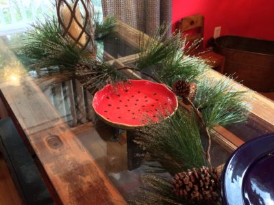
Weird? no not really! Colour is such a personal thing in many respects, you get a reaction if you really like a colour and it evokes a feeling in you that either makes you feel good or not. This colour is cheerful and makes me happy. For someone who suffered many years of depression I wanted something fun. Personally after we did the kitchen renovation I wanted the dining room to have a different take on the ‘Eating Room Red’ So I picked my flavour of watermelon and raspberry.
I choose ‘Spring Tulips 2001-30’ by Benjamin Moore.
One because it matched my Muskoka sweatshirt (I know crazy right lol) and two because here in Nova Scotia winters can be soooooooo long. I wanted something bright and cheerful and loved the way the white kitchen and watermelon colour looked together. Actually there’s a third thing that prompted the colour and that was the flowers in the kitchen. They’re two hues of pink, and orange so I took cues from them as well and started checking out some samples.
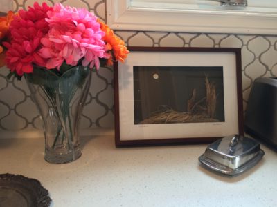
The nice thing about designing a space for your own house is that you can choose to do something a little different and you don’t have to run it by anyone. Ok I consulted my husband but thankfully he’s like ” I trust you, do whatever you think is best’ 🙂 yeah
∇
“What’s the fun of being a decorator if you can’t try something new and fresh in your own house”
Δ
And now the ‘After’
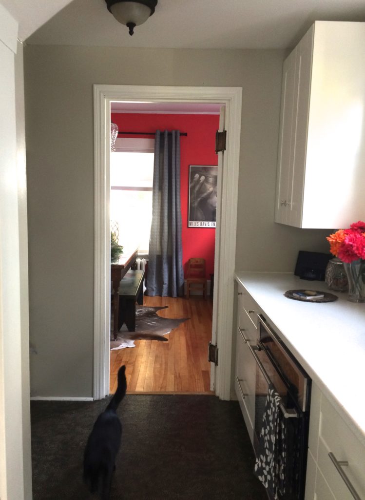
View from the Kitchen
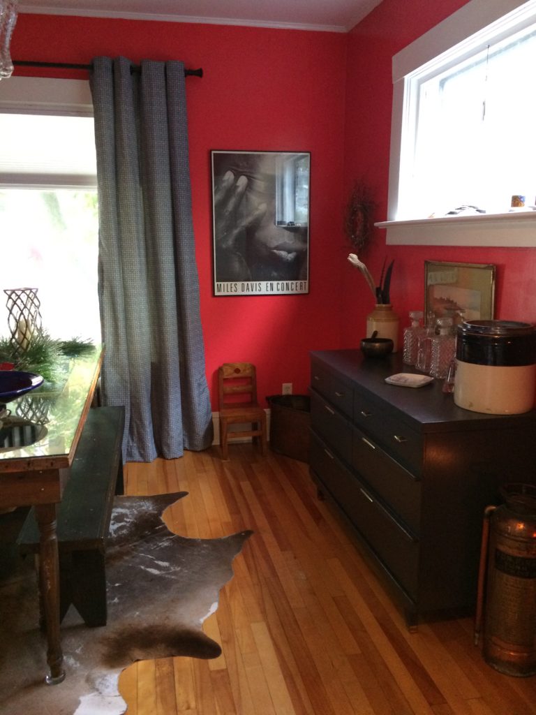
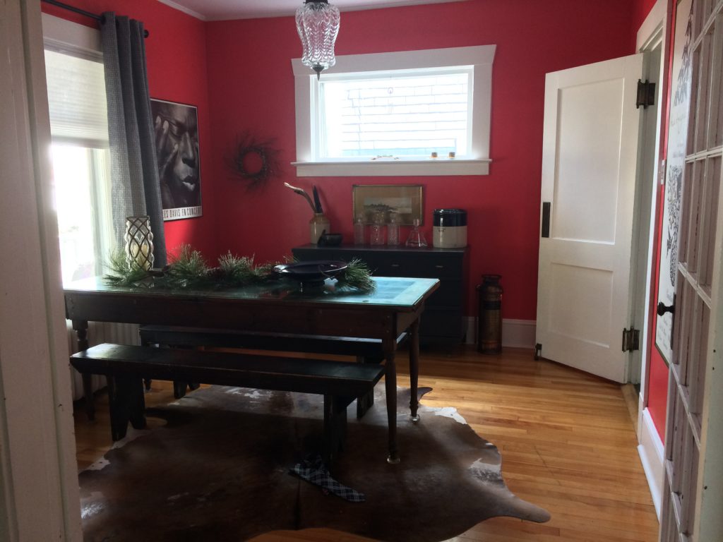
The brass antique Firehose and the copper newspaper or firewood tub plays well together with this bright colour! I absolutely love the pairing of them together.
♥
Different don’t you think? I love this Coral colour!!
♥
~
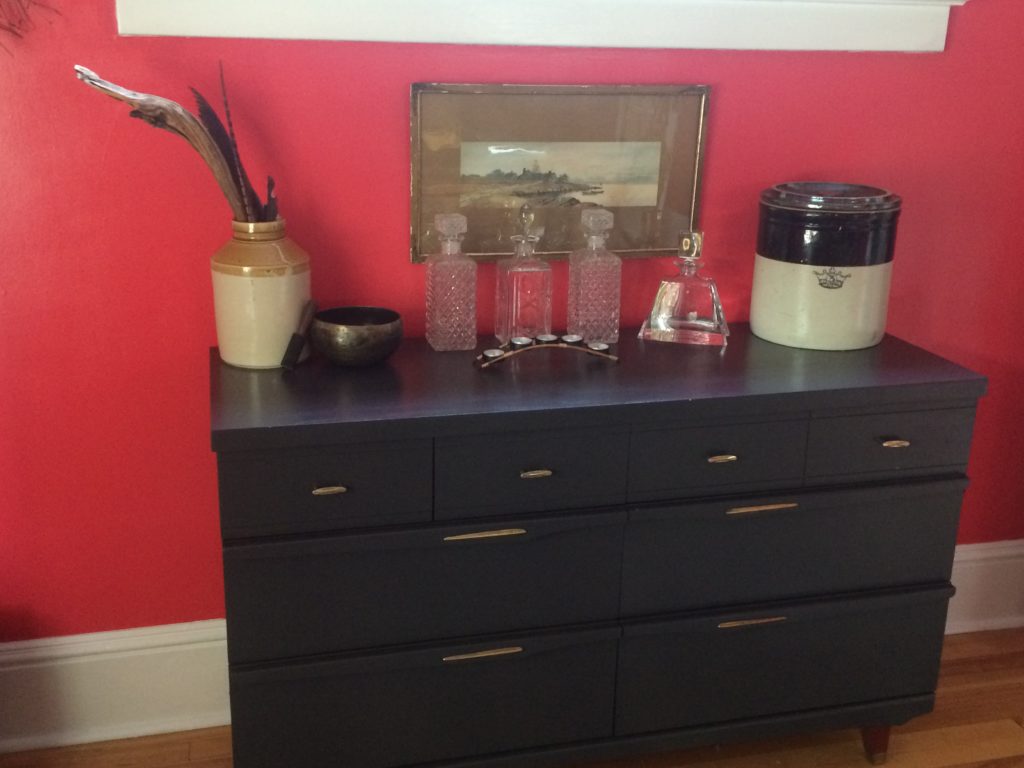
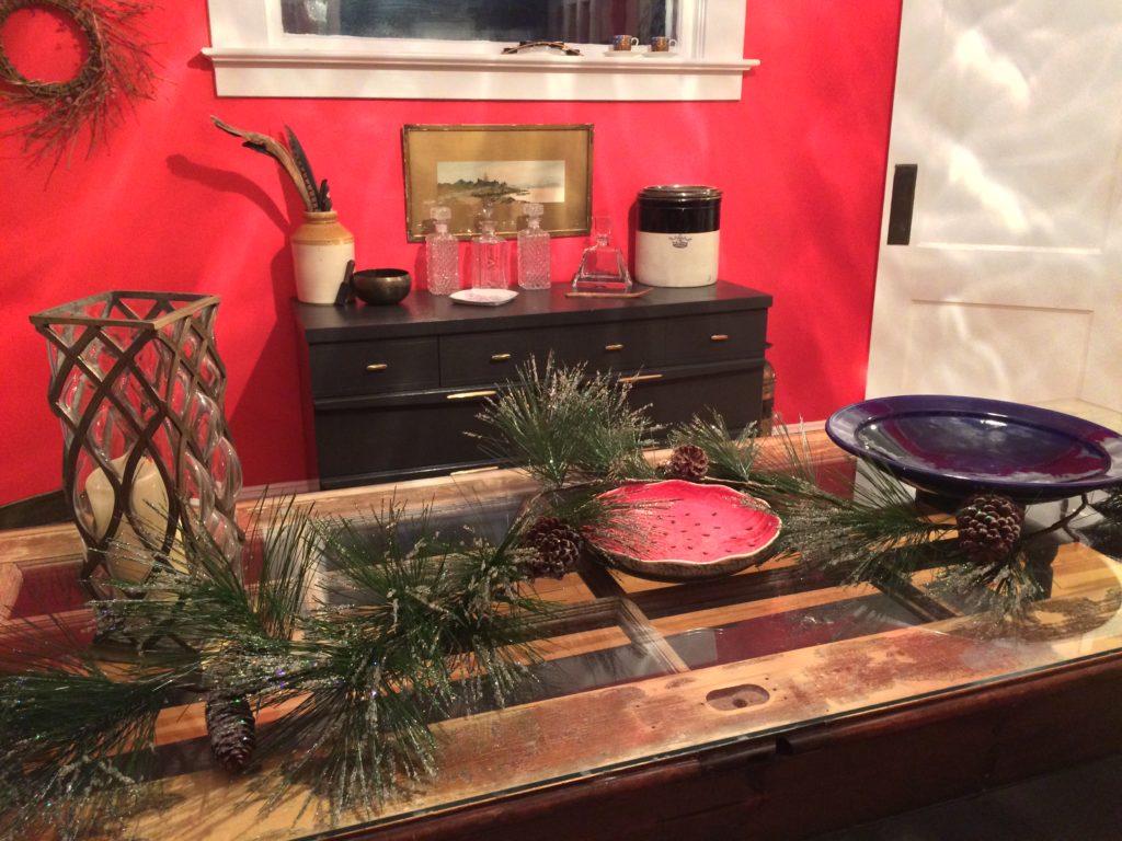
Do you remember this secondhand piece I did over in the summer well here she sits! It worked out so well in this deep grey/black (looks blue in the photo.) It’s actually called ‘Black Jack’ 2133-20 by Benjamin Moore. I didn’t touch the hardware and left it as it and couldn’t be happier. So much storage for this piece, hides all the things you don’t want to see and a great serving area when it’s needed.
~
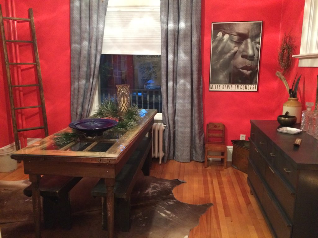
Lighting has such a effect on a room, look at the picture above and below to see how the light filtering in from the piano window alters the colour of the walls. So Important to see the space in the daytime to get a idea of the natural light so that you can also play with the other lighting in the room. In this case there is only the chandelier and candlelight to add to the ambience.
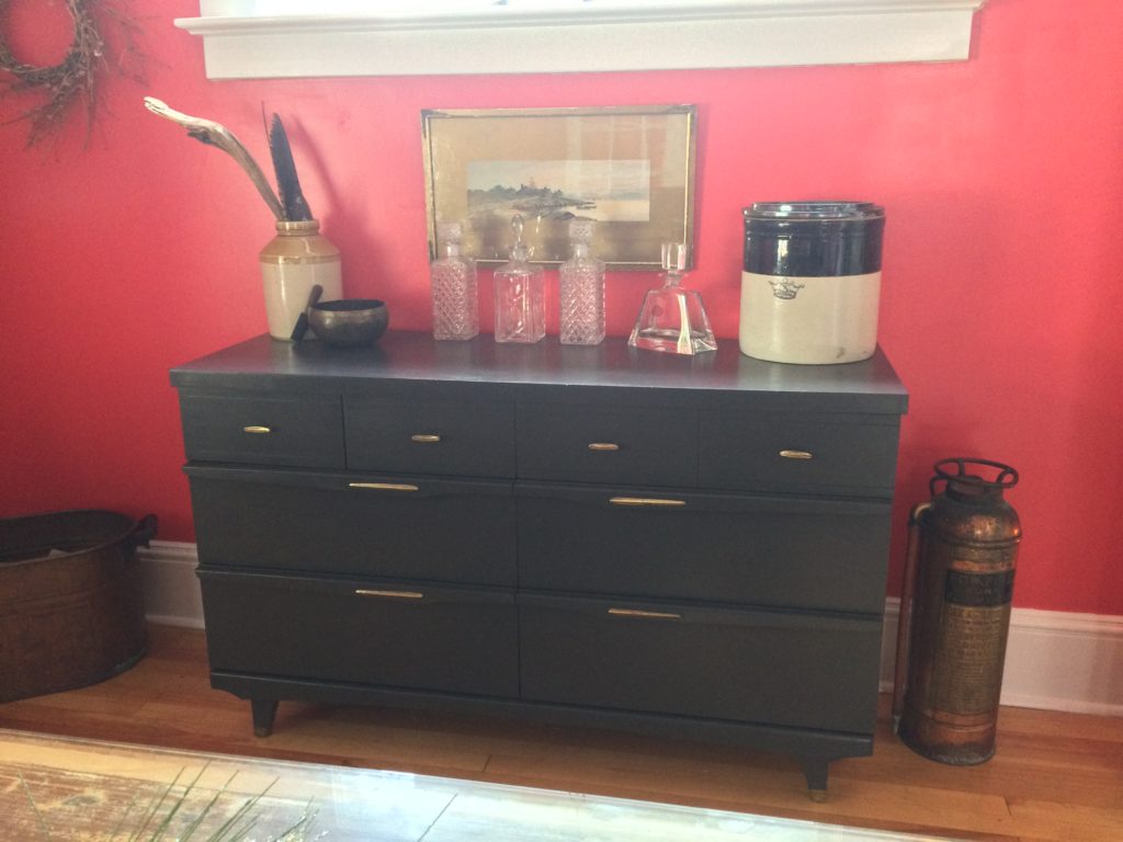
Remember this secondhand piece, all redone and reloved to fit perfectly as a buffet in the space.
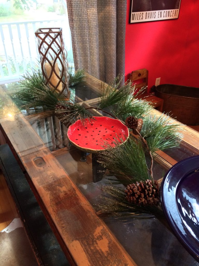
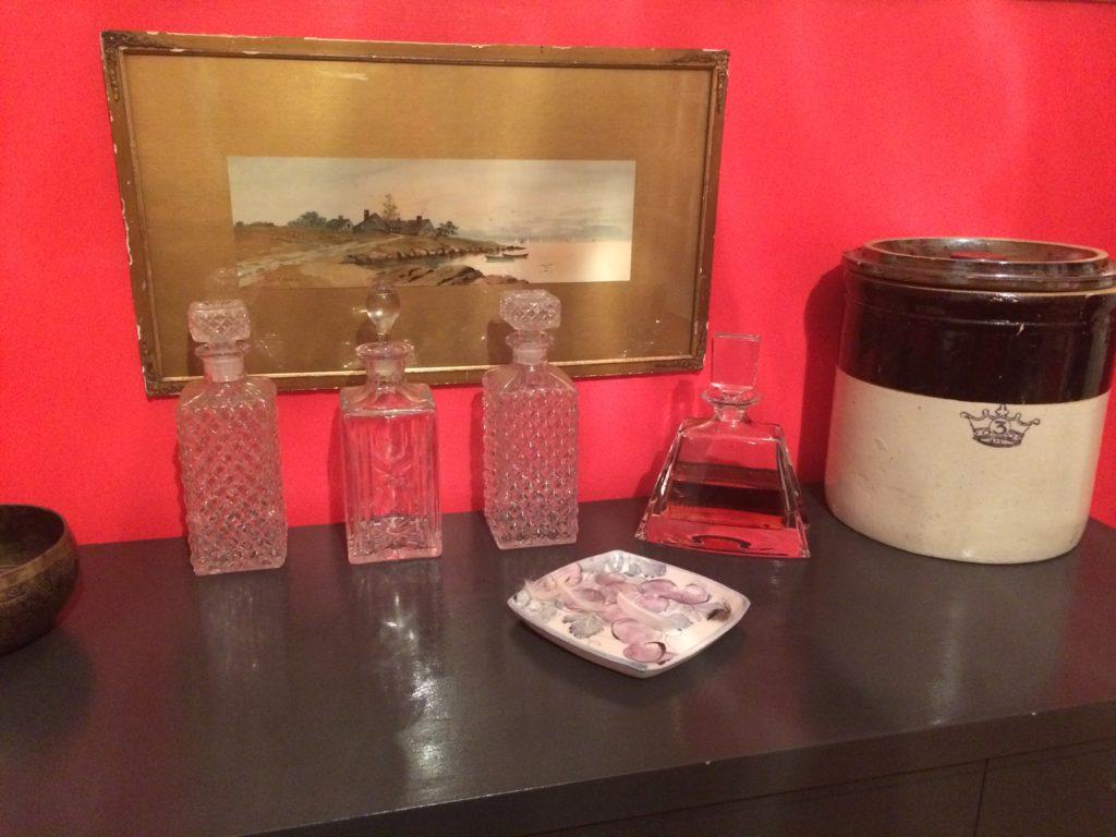
‘Value Vollage’ as we say ‘ little watermelon’ plate fits right in and was one of the jumping off points for the colour inspiration.
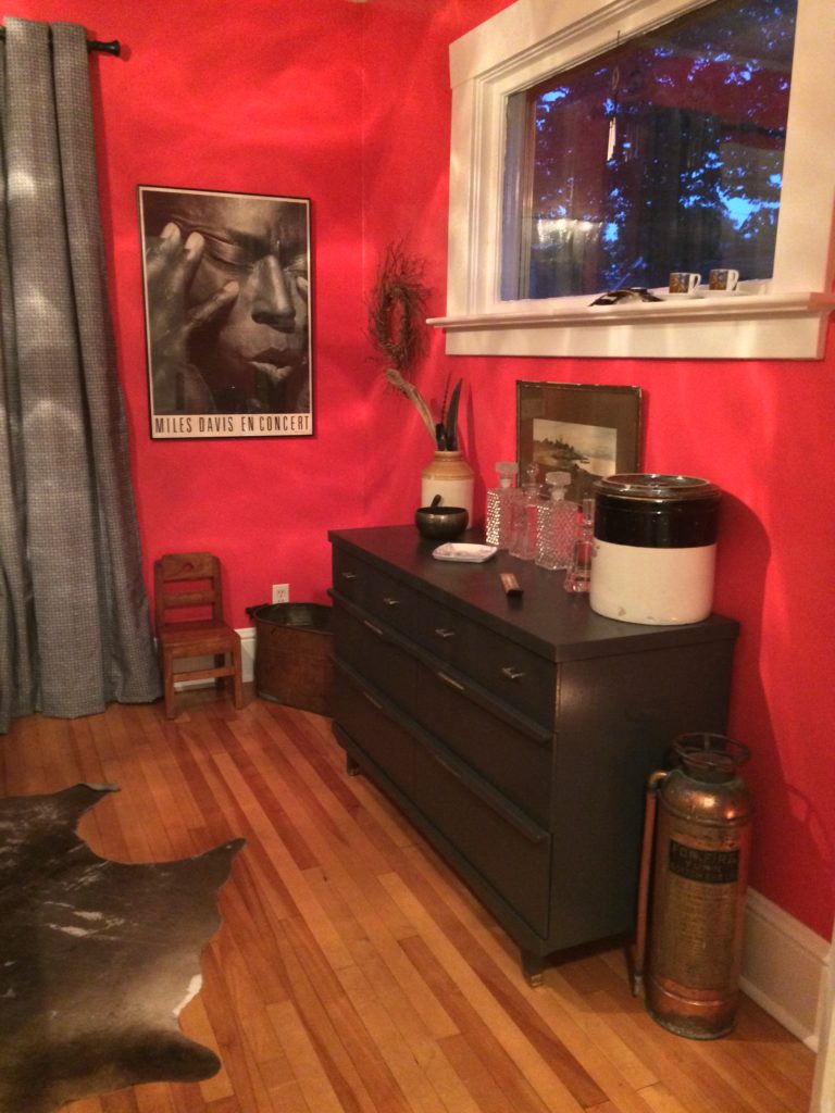
Some night time lighting makes all the difference with ambiance. Love how the chandelier casts a pattern on the room. The brass, the black and white print of Miles Davis is a nice contrast with the colour.
~
~
~
~

~
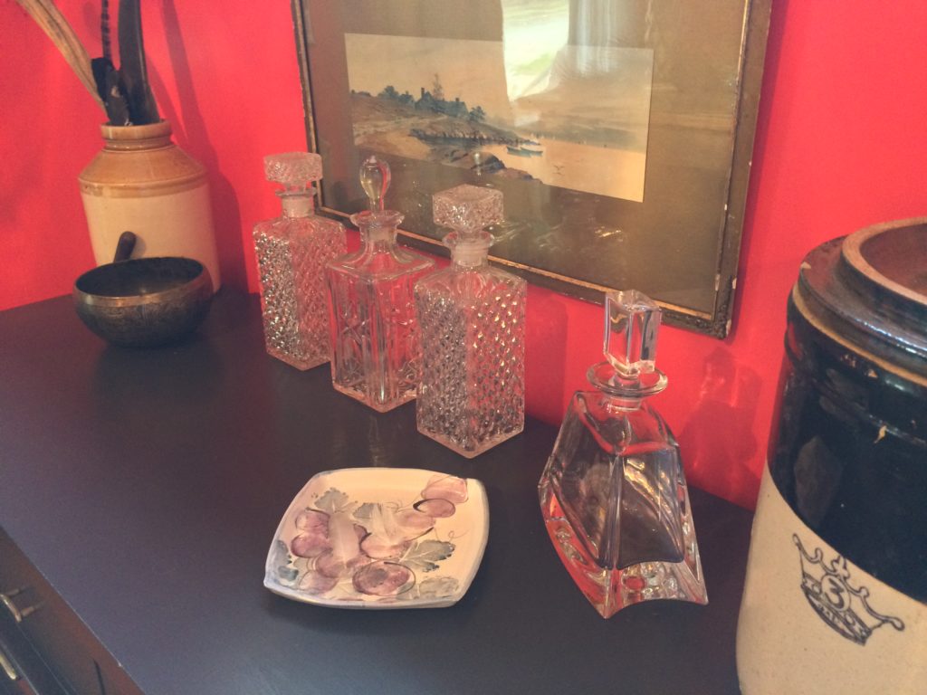
The Antique frame is chipped and warn and that’s why I love it. The olive in the picture is another part of the design scheme and goes well with the old stone jug and canister. One on the right and left can be found at antique stores or at flea markets. It’s the joy of the hunt if you ask me. So happy I found the crown #3 with a lid, lids are hard to find so if you see one scoop it up!

~
Glass decanters are great for that bar look. Mixing vintage with a new contemporary one and the stone ironware #3 is a awesome place to hide the nutella. Just saying ;-0.
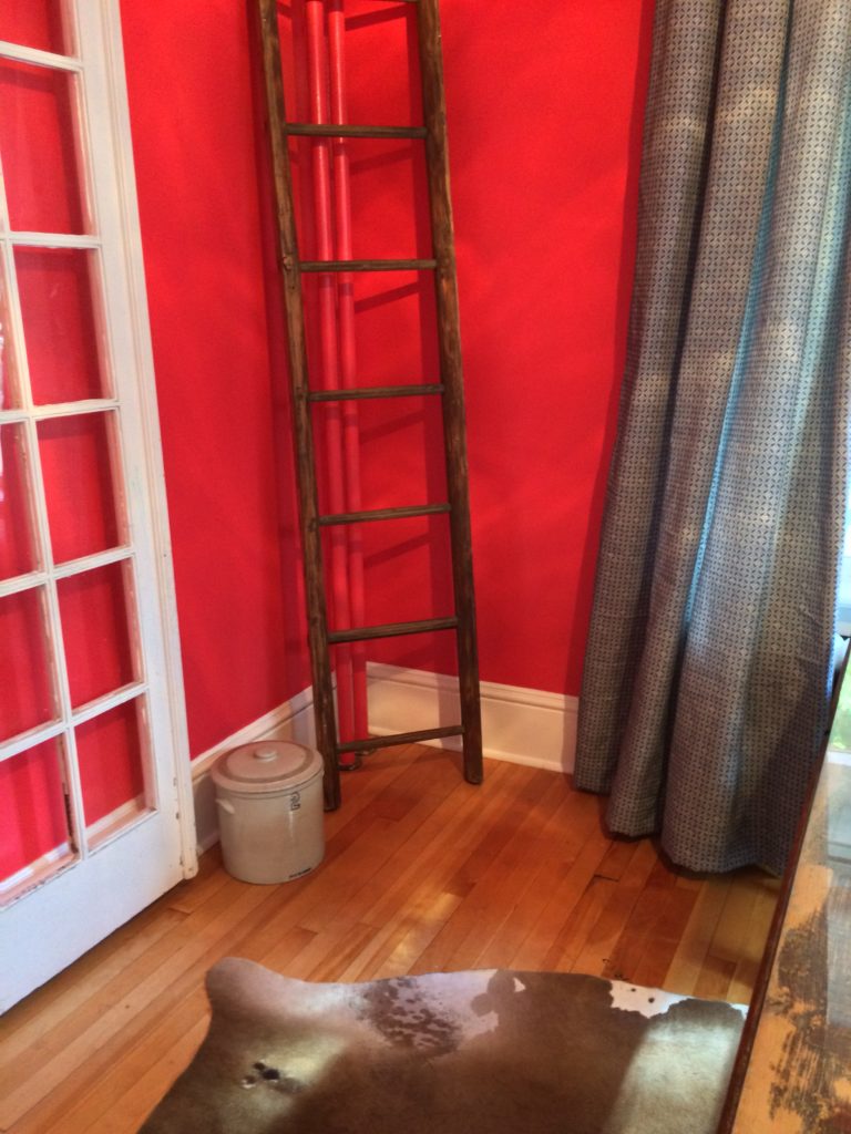
This tall ladder we got from a place called the ‘Beggars Bench’ in Ottawa. It’s also great for hanging newspapers over the rings or your favourite magazines.
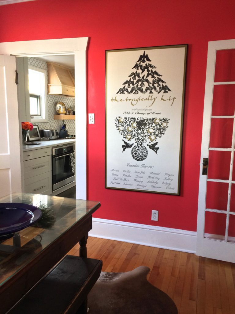
We had another piece of Art on this wall but the ‘Tragically Hip’ played better with the same olive colour in the matt and the olive background in the Antique picture above the buffet. Love the white, olive and black in this, white plays well off the bright walls.
♦
TAKE AWAY: Never be afraid to try a different colour, the beauty of paint is that if you don't like you can easily change it. Look for secondhand pieces that can be easily transformed to accommodate your new design.
♦
What’s your next colour choice for a dining room makeover?
♥
Leave me comments below would love to hear your thoughts.

