Meeting new clients is always a wonderful experience when starting a new project. This young couple who had recently completed their new fabulous house with big bright windows, hight ceilings, a great room and open style kitchen were now ready to make the inside sing as well. What they needed help on was pulling their space all together. The goal then was to use some of their existing furniture, buy new pieces that injected some tech/rustic vibe they liked and do a furniture arrangement to better suit their needs as a thriving couple with busy lives and a new bundle of joy! I worked with these clients to decorate/update their living room, great room and entryway. Today, I’m sharing the great room. It’s one big open space as you enter the home and you can see everything as soon as you walk in the door. The goal was then to create a relaxing space that reflected more of their personalities. Here’s where it all began …
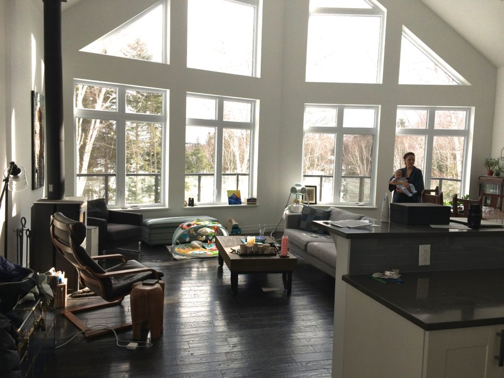
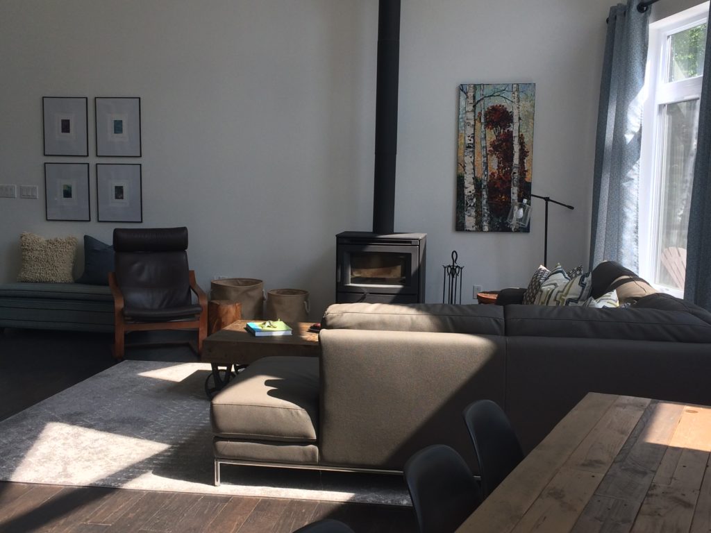
The bones of the house were fantastic but the furniture arrangement wasn’t ideal and they wanted a more pulled together look. Some of the furniture pieces the clients wanted to keep and then some pieces were relocated to their basement. I’m always interested in using what the clients have/want and love. Then getting new pieces that fit the overall look and feel the client is going for. In this case the clients wanted a new dining table and couch, to start and then the rest flowed from there. It’s always fun to see how a space can be transformed with furniture arrangement, area rugs, drapery and accessories. It’s the magic of decorating and layering pieces with artwork, pillows, accessories and furniture etc. With these gorgeous windows the light floods in and you immediately get that sense of a warm and welcoming space. Just like the clients who were just that! Then through the magic of photo’s here is the AFTER.
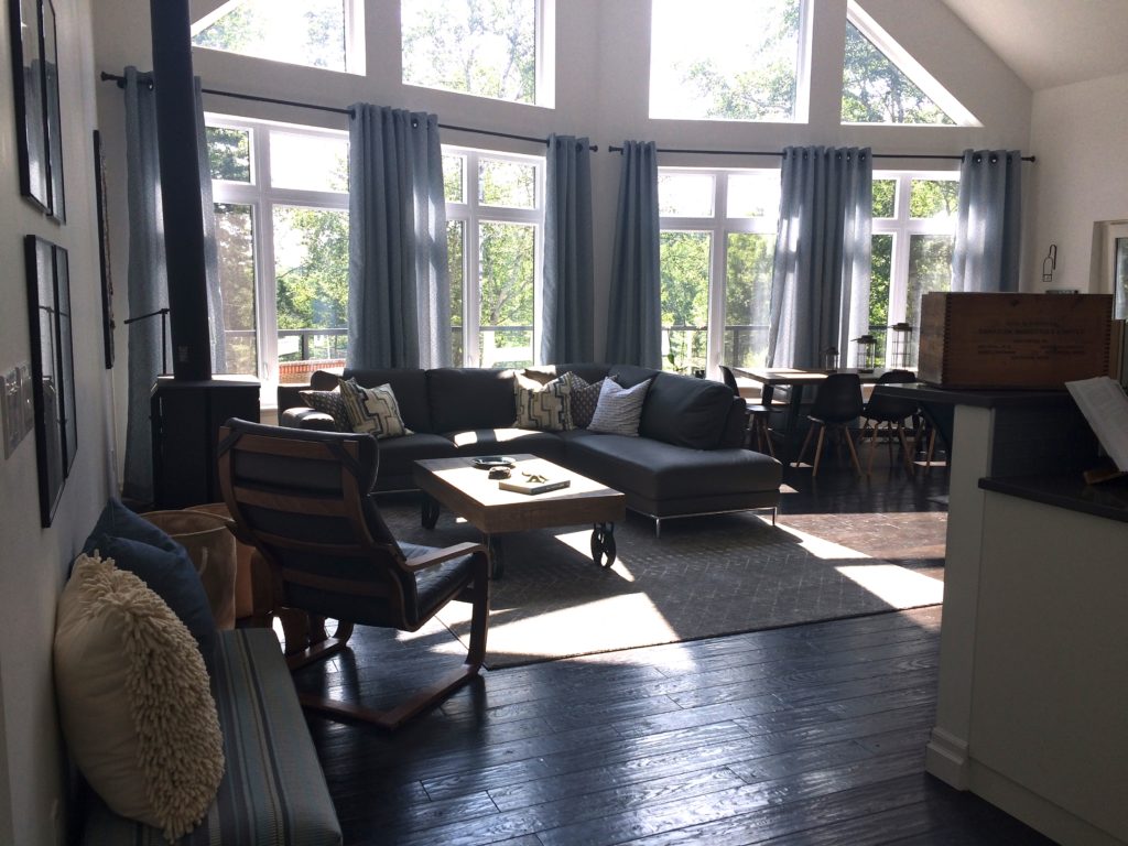
This is the view as soon as you walk in the door. Previously the clients had nowhere to put their shoes and boots on so using the rectangle ottoman that they already had was the perfect spot to fit on the wall right next to the front door. The previous blue trunk made it’s way down to the basement for another use. Recycle, reuse and reinvent always my motto 🙂 Great thing about the ottoman, it flips open and out of season shoes and boots can be stored out of site but still accessible.
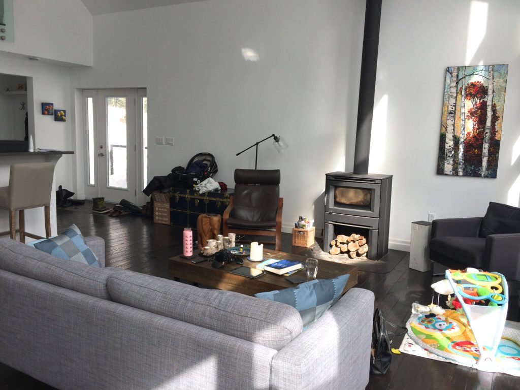
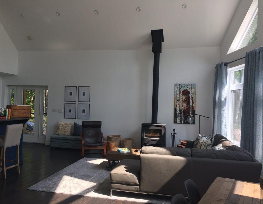
Area rugs do a wonderful job of defining zones especially when it’s open concept like this house. Here this plush sandy, grey brown rug {source AllMODERN} anchors the space for the living zone. I like that there’s enough space on the side wall to sit then it opens up to the living area while still giving them space to flow into the room.
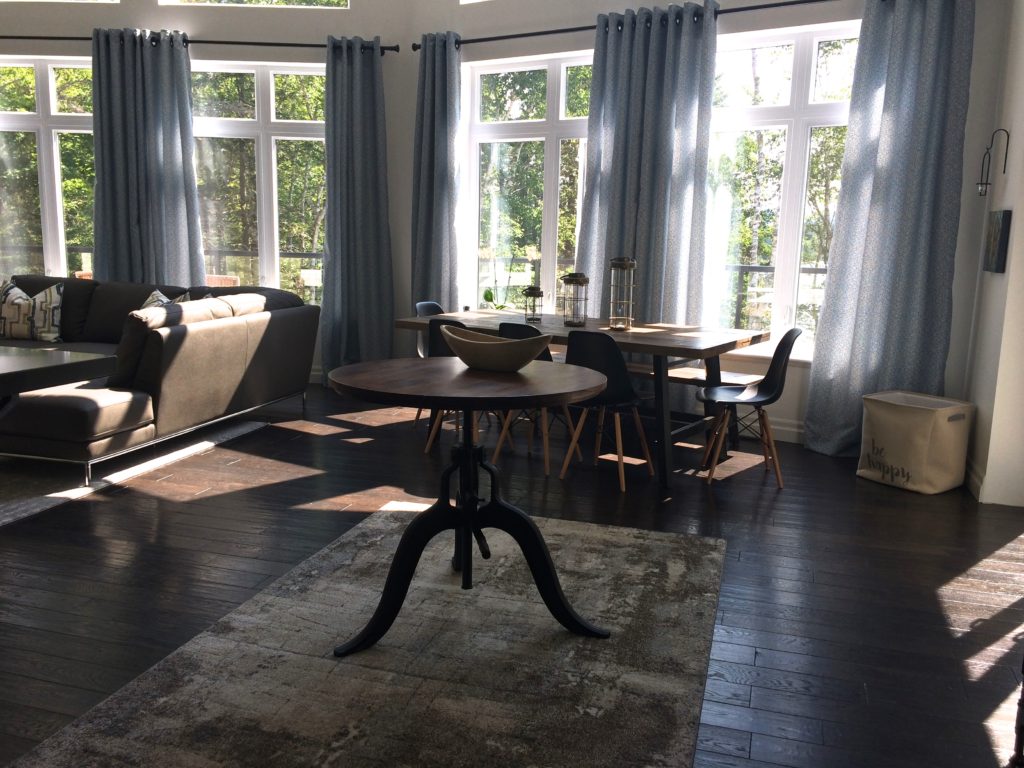
The back area closer to the windows became the dining room zone. Loved this dinning room table {from Wicker Emporium} with the bench on the one side and chairs on the other so the clients have the flexibility of pulling the table out for more room when they have a larger crowd or resting the table closer to the wall for more space around the ‘crank’ table. This table in the middle is so versatile, you can ‘crank’ or unwind it down so it’s the height of a coffee table or ‘crank’ it all the way so it’s bar height. It can be used as a game table or extra serving space when your having a party. I love this little table and thankfully the clients did as well. Great cast iron legs and natural wood top. The stools from the kitchen counter island are ideal to swing over and then the table can be game central or a work zone for your laptop and papers. The rug {Home Depot} underneath also creates a separate zone between the dinning and living area. Just a nice way to transition from one area to another in this big open space. {oh and a little spot for baby toes and a little play area}
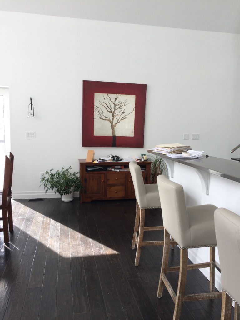
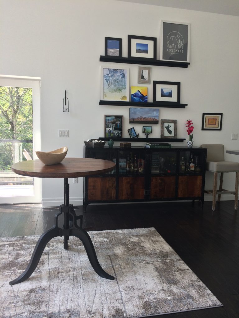
I love this after and how it turned out. Although the artwork was great {we showcased it elsewhere } it seemed to get lost on such a huge wall. The clients wanted a gallery where they could display their artwork and prints from their travels. With the multiple thin shelves {thank you Ikea} above this credenza {also thank you Wicker Emporium} we were able to showcase their many prints and photo’s that have special meaning to them. And that’s what it’s all about – you want to feel like your home reflects the style and personalities of the home owners.
Another look back at a before from the second floor looking over the great room …
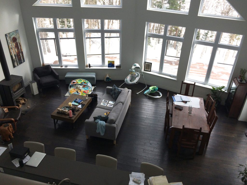
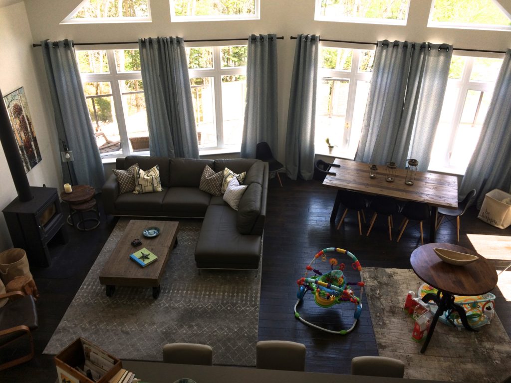
Don’t you just want light a fire, curl up on that couch and relax on a cold winters day. { I do lol } The curtains do wonders as well for making spaces feel cosier and adding that hint of colour to co-ordinate with the rest of the room’s features. And can’t forget baby … toys still function great in the space and a reminder that little humans are important too when planning and designing a room.

Simple {and cheap just a gallon of paint} but an effective impact in the kitchen. Just painting the kitchen island this fantastic dark navy by Benjamin Moore called ‘Gentleman’s Grey’ 2062-20 adds that hit of colour to anchor the space. The little reading nook on the second floor got a shelf makeover and pop of orange for a splash of colour which is perfect side by side the water blues in the Artwork above the reading chair.
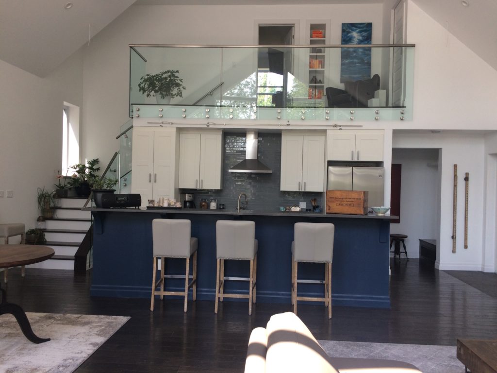
I love how this great room turned out but most importantly, so do the clients. In a recent thank you note she said ” …thank you for transforming our space/home! ..you were fantastic. ” 🙂 music to my ears when clients are happy, it really does make my day!
We took a already beautiful house and created this layered, comfortable yet stylish and functional great room into a family room that will stand the test of time and grow with this wonderful family. Next up I’ll be sharing some the details that make up this inviting home.
TAKEAWAY TIP: Invest in good quality furniture that you not only love but will stand the test of time.

